Colors & Styles Explained
Colors are the foundation of your design system. The 88 Component Library provides a structured set of color variables that keep your designs consistent, accessible, and easy to maintain across all projects.
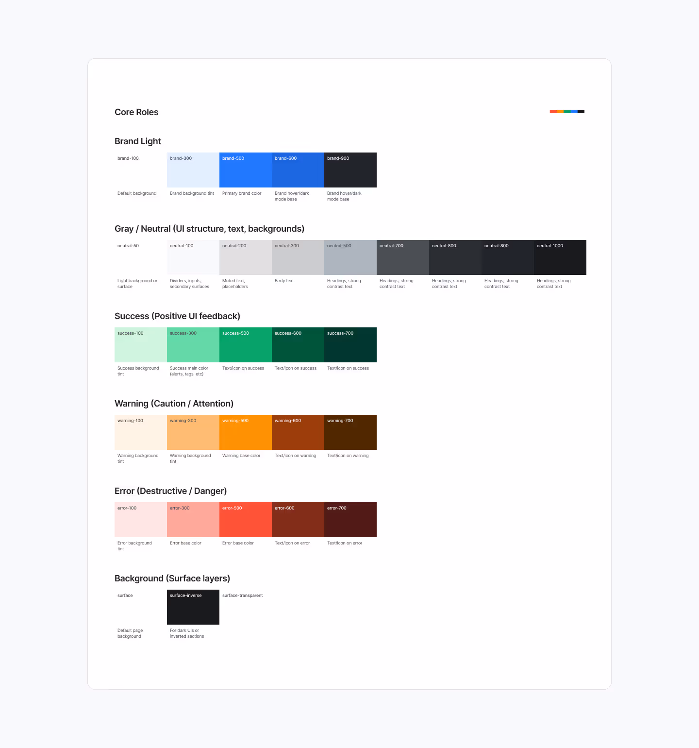
1. Core Palette
The system includes a balanced palette of brand, neutral, and alert colors. These are defined as variables, which means they can be applied anywhere in your project and updated globally.
- Brand: Primary identity colors (light tints, base, hover states).
- Neutral: Grays used for backgrounds, dividers, inputs, and text.
- Success, Warning, Error: Feedback states for alerts, messages, and validation.
- Surface: Background layers for light and dark modes.
2. Why Use Variables
Variables ensure your color system scales. Instead of applying custom hex codes to every element, you assign a variable (e.g., brand-500). Changing the variable updates all components linked to it — saving time and reducing errors.
3. Accessibility
All colors are built with the OKLCH color space, which ensures perceptual consistency and accessibility across devices. Contrast has been tested for WCAG compliance, so your designs remain legible and inclusive.
4. Applying Colors in Figma
- Select the element you want to style.
- In the Fill or Stroke panel, click the Style (four dots icon).
- Choose the variable from the list (e.g., neutral-200 for muted text).
- The style is now linked to the system, ensuring consistency.
5. Best Practices
- Always use variables instead of custom hex values.
- Stick to defined roles (brand for primary, neutral for text, success/warning/error for feedback).
- Use surface backgrounds for clear section separation.
- Test color combinations for contrast when designing custom layouts.
Final Words
Using color variables keeps your designs flexible, consistent, and accessible. In the next article, we’ll explore Typography Basics and how text styles create a clear visual hierarchy.